Exploring datasets with statistics and scatterplots
Often, one or more data pre-processing step(s) may be required to proceed with the analysis. And, after the analysis, maybe you would like to visualize the result or datasets
The Iris flower data set, also known as Fisher’s or Anderson’s Iris data set,
is a multivariate dataset introduced by the British statistician and biologist
Ronald Fisher in his 1936 paper (Fisher 1936).
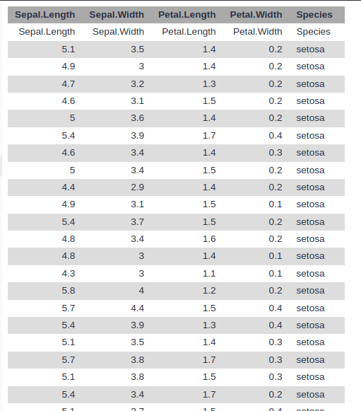
Each row of the table represents an iris flower sample,
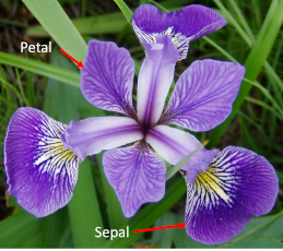
describing its species and the dimensions in centimeters of its botanical parts, the sepals and petals.

Quick Start
- Create a new History
- Rename your history to be meaningful and easy to find.
- Upload the Iris dataset
iris.csv
https://zenodo.org/record/1319069/files/iris.csv
- View the dataset
- Rename the dataset to
iris
- Check the datatype and change the datatype if it is different than
csv.
- Add an
#iris tag to the dataset
Go Up
Pre-Processing
The tools we will use require tab-separated input data and assume there is no header line.
Since our data is comma-separated and has a header line,
we will have to perform the following pre-processing steps to prepare it for the actual analysis:
- Format conversion
- Header removal
- Convert the CSV file (comma-separated values) to tabular format (tsv; tab-separated values)
- In the central panel, click on the Convert tab on the top \
- In the upper part Convert select
tabular (using csv-to-tabular)
- Click the Create dataset button to start the conversion.
- Rename the resulting dataset to
iris tabular
- View the generate file
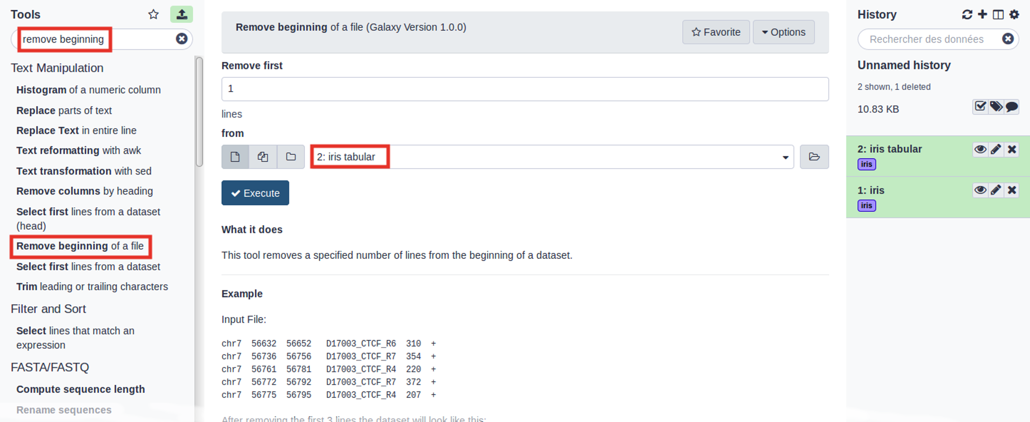
- Use the tools search box at the top of the tool panel to find
Remove beginning
Remove beginning with the following parameters:
- Remove first: 1 (to remove the first line only)
- from: select the
iris tabular file from your history
- Execute

- Rename the resulting dataset to
iris clean
- View the generate file
Question
- How many samples (lines) does our dataset contain?
Go Up
Data Analysis: What does the dataset contain?
How many different species are in the dataset?
In order to answer this question, we will have to look at column 5 of our file, and count how many different values (species) appear there. There are several ways we could do this in Galaxy.
One approach might be to first extract this column from the file, and then count how many unique lines the file contains.
Cut columns from a table with the following parameters:
- Cut columns: c5
- Delimited by: tab
- From: select the
iris clean file from your history
- Rename the resulting dataset to
iris species column
- View the generate file
Unique occurrences of each record with the following parameters:
- File to scan for unique values: select the
iris species coulumn file from your history
- Rename the resulting dataset to
iris species
- View the generate file
Question
- How many different species are in the dataset?
- What are the different Iris species?
Grouping dataset
- Try answering this question (how many Iris species are in the file?) again, using a different approach:
- Did you get the same answer as before?
- Rename the resulting dataset to
iris species group
Go Up
How many samples by species are in the dataset?
Now that we know that there are 3 different species in our dataset, our next objective is determining how many samples
of each species we have. To answer this, we need to look at column 5 again,
but instead of just determining how many unique values there are, we need to count how many times each of them occurs.
- Re-run the
Group tool with the following parameters:
- Select data:
iris clean
- Group by column: Column: 5
- Insert operation:
- Rename the resulting dataset to
iris samples per species group
- View the generate file
Question
- How many samples per species are in the dataset?
Analysis: How to differentiate the different Iris species?
We know that we have 3 species of iris flowers, with 50 samples for each:
- setosa
- versicolor
- virginica

Our aim is to find out whether the features we have been given for each species can help us to highlight the differences between the 3 species.
In our dataset, we have the following features measured for each sample:
- Petal length
- Petal width
- Sepal length
- Sepal width

Go Up
Generate summary and descriptive statistics
Get the mean and sample standard deviation of Iris flower features
Datamash tool with the following parameters:
- Input tabular dataset:
iris tabular
- Group by fields: 5
- Input file has a header line: Yes
- Print header line: Yes
- Sort input: Yes
- Print all fields from input file: No
- Ignore case when grouping: Yes
- In Operation to perform on each group:
- Insert Operation to perform on each group
- Insert Operation to perform on each group
- Type: Sample Standard deviation
- On column: c1
- Insert Operation to perform on each group
- Type: Mean
- On column: c2
- Insert Operation to perform on each group
- Type: Sample Standard deviation
- On column: c2
- Insert Operation to perform on each group
- Insert Operation to perform on each group
- Type: Sample Standard deviation
- On column: c3
- Insert Operation to perform on each group
- Insert Operation to perform on each group
- Type: Sample Standard deviation
- On column: c4
- Rename the resulting dataset to
iris summary and statistics
- View the generate file
Question
- Can we differentiate the different Iris flower species?
Go Up
Visualize Iris dataset features with two-dimensional scatterplots
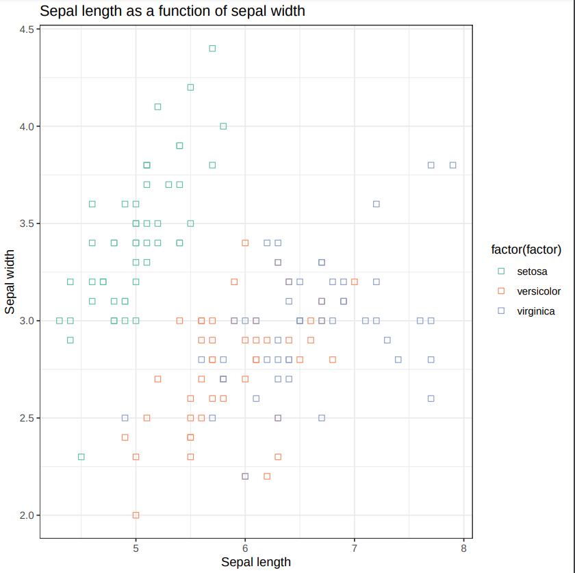
Scatterplot w ggplot2 with the following parameters:
- Input tabular dataset:
iris clean
- Column to plot on x-axis: 1
- Column to plot on y-axis: 2
- Plot title: Sepal length as a function of sepal width
- Label for x axis: Sepal length
- Label for y axis: Sepal width
- In Advanced Options:
- Data point options: User defined point options
- relative size of points: 2.0
- *Plotting multiple groups: Plot multiple groups of data on one plot
- column differentiating the different groups: 5
- Color schemes to differentiate your groups: Set 2 - predefined color pallete
- In Output Options:
- Additional output format: PDF
-
View the generate plot

- Rename the resulting dataset to
iris sepal scatterplot
Question
- What does this scatter plot tell us about Iris species?
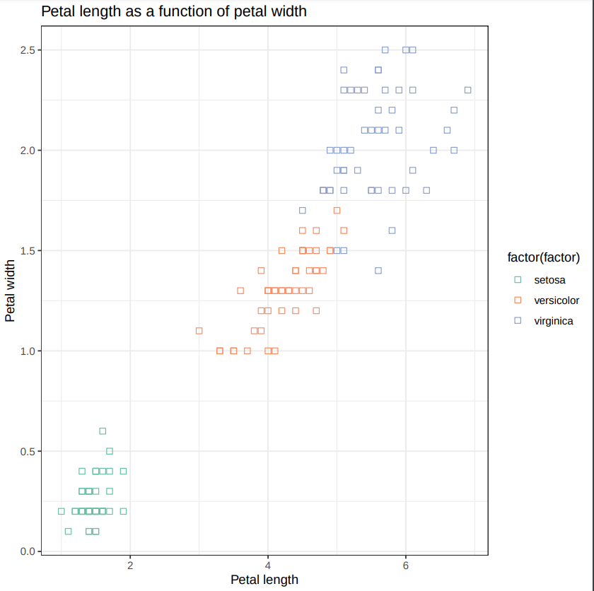
- Make a new scatter plot, this time with Petal length versus Petal width.
-
Can we differentiate between the three Iris species?

Go Up
Galaxy Management
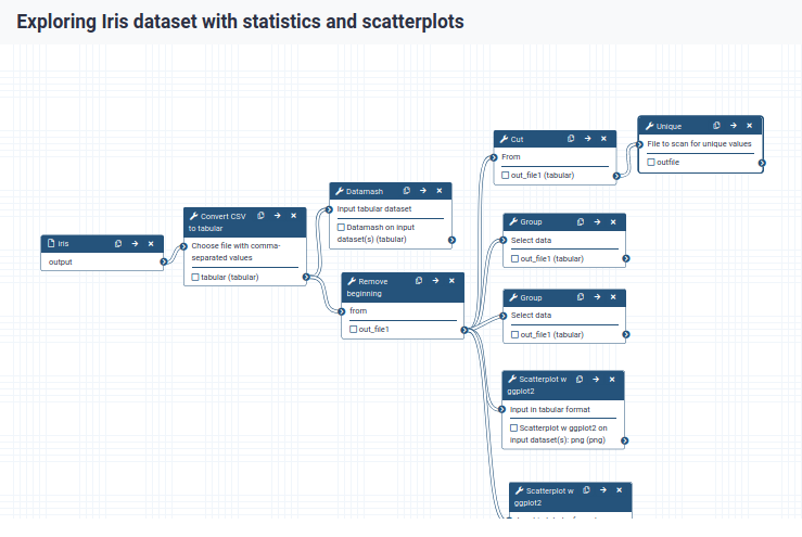
Convert your analysis history into a workflow
- Follow the instructions from the previous lecture
- Replace the Workflow name to something more descriptive, for example:
Exploring Iris dataset with statistics and scatterplots.
-
Click on Workflow in the top menu of Galaxy.

The workflow editor
- Open the workflow editor
- Click on the dropdown menu to the right of your workflow name.
- Select Edit to launch the workflow editor.

- When you click on a workflow step, you will get a view of all the parameter settings for that tool on the right-hand side of your screen (the Details section)
- You can also change the parameter settings of your workflow here, and also do more advanced configuration.
- Hiding intermediate outputs
- By default, all outputs will be shown
- Click the checkbox next to the outputs to mark them as important:
- outfile in
Unique step
- out_file1 in
Group step
- png in both
Scatterplot w ggplot2 steps
- Now, when we run the workflow, we will only see these final outputs
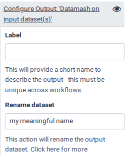
- Renaming output datasets
- Let’s rename the outputs we marked as important with the checkbox (and thus do not hide) to more meaningful names:
Unique tool, output outfile: rename to categoriesGroup tool, output out_file1: rename to samples per category- Rename the scatterplot outputs as well, remember to choose a generic name, since we can now also run this on data other than iris plants.

- Save your workflow (important!) by clicking on the icon at the top right of the screen.
- Return to the analysis view by clicking on the Home icon (or Analyze Data on older Galaxy versions) at the top menu bar.
Go Up
Run workflow on different data
Now that we have built our workflow, let’s use it on some different data. For example, let us explore the diamonds dataset
The original dataset consists of 53940 specimen of diamonds, for which it lists the prices and various properties.
For this training, we have created a simpler dataset from the original, in which only the five columns relating to
the price and the so-called 4 Cs (carat, cut, color and clarity) of diamond characteristics have been retained.
- Carat refers to the weight of the diamond when measured on a scale
- Cut refers to the quality of the cut and can take the grades Fair, Good, Very Good, Premium and Ideal
- Color describes the overall tint, or lack thereof, of the diamond from colorless/white to yellow and is given on a letter scale ranging from D to Z (D being the best, known as colorless).
- Clarity describes the amount and location of naturally occuring “inclusions” found in nearly all diamonds on a scale of eleven grades ranging from Flawless (the ideal situation) to I3 (Included level 3, the worst quality).
Starter Pack
- Create a new History
- Rename your history to be meaningful and easy to find.
- Upload the Iris dataset
diamons.csv
https://zenodo.org/record/3540705/files/diamonds.csv
- View the dataset
- Rename the dataset to
diamond
- Add an
#diamond tag to the dataset
Run workflow
- Open the workflow menu (top menu bar), Find the workflow you made in the previous section and Select the option Run.
- Select the
diamonds dataset as the input dataset.
- Customize the first scatter plot:
- Customize the second scatter plot.
- Click Run workflow.
- Once the workflow has started, you will initially be able to see all its steps, but the unimportant intermediates will disappear after they complete successfully
Question
- How many cut category are there in the Diamond dataset ?
- How many samples are there in each cut category ?
- What do you notice about the relationship between price and carat ?
- Based on the plot showing Price vs. Carat with Clarity as a factor, do you think clarity accounts for some of the variance in price? Why ?
Go Up
